Image

| Registration Type | Member Price |
|---|---|
| Early Bird Registration (Sept. 11-Oct.3) | $750 |
| General Registration (Oct. 4-Oct.17) | $850 |
| Registration Type | Member Price | Non-Member Price |
|---|---|---|
| Early Bird Registration (Sept. 11-Oct. 3) | $750 | $850 |
| General Registration (Oct. 4-Oct.17) | $850 | $950 |
Not a member? We'd love to have you join us for this event and become part of the Chorus America community! Visit our membership page to learn more, and feel free to contact us with any questions at [email protected].
| Registration Type | Non-Member Price |
|---|---|
| Early Bird Registration (Sept. 11-Oct. 3) | $850 |
| General Registration (Oct. 4-Oct.17) | $950 |
Think you should be logged in to a member account? Make sure the email address you used to login is the same as what appears on your membership information. Have questions? Email us at [email protected].
| Registration Type | Price |
|---|---|
| Individual Session | $30 each |
| All Four (4) Sessions | $110 |
*Replays with captioning will remain available for registrants to watch until November 1, 11:59pm EDT.
Member Professional Development Days are specially designed for Chorus America members. If you're not currently a member, we'd love to welcome you to this event, and into the Chorus America community! Visit our membership page to learn more about becoming a member of Chorus America, and please don't hesitate to reach out to us with any questions at [email protected].
| Registration Type | Price |
|---|---|
| Individual Session | $30 each |
| All Four (4) Sessions | $110 |
*Replays with captioning will remain available for registrants to watch until November 1, 11:59pm EDT.
| Registration Type | Price |
|---|---|
| Individual Session | $30 each |
| All Four (4) Sessions | $110 |
*Replays with captioning will remain available for registrants to watch until November 1, 11:59pm EDT.
Member Professional Development Days are specially designed for Chorus America members. If you're not currently a member, we'd love to welcome you to this event, and into the Chorus America community! Visit our membership page to learn more about becoming a member of Chorus America, and please don't hesitate to reach out to us with any questions at [email protected].
Your website has one job: move visitors toward action. Here's how to make sure it's actually doing it.
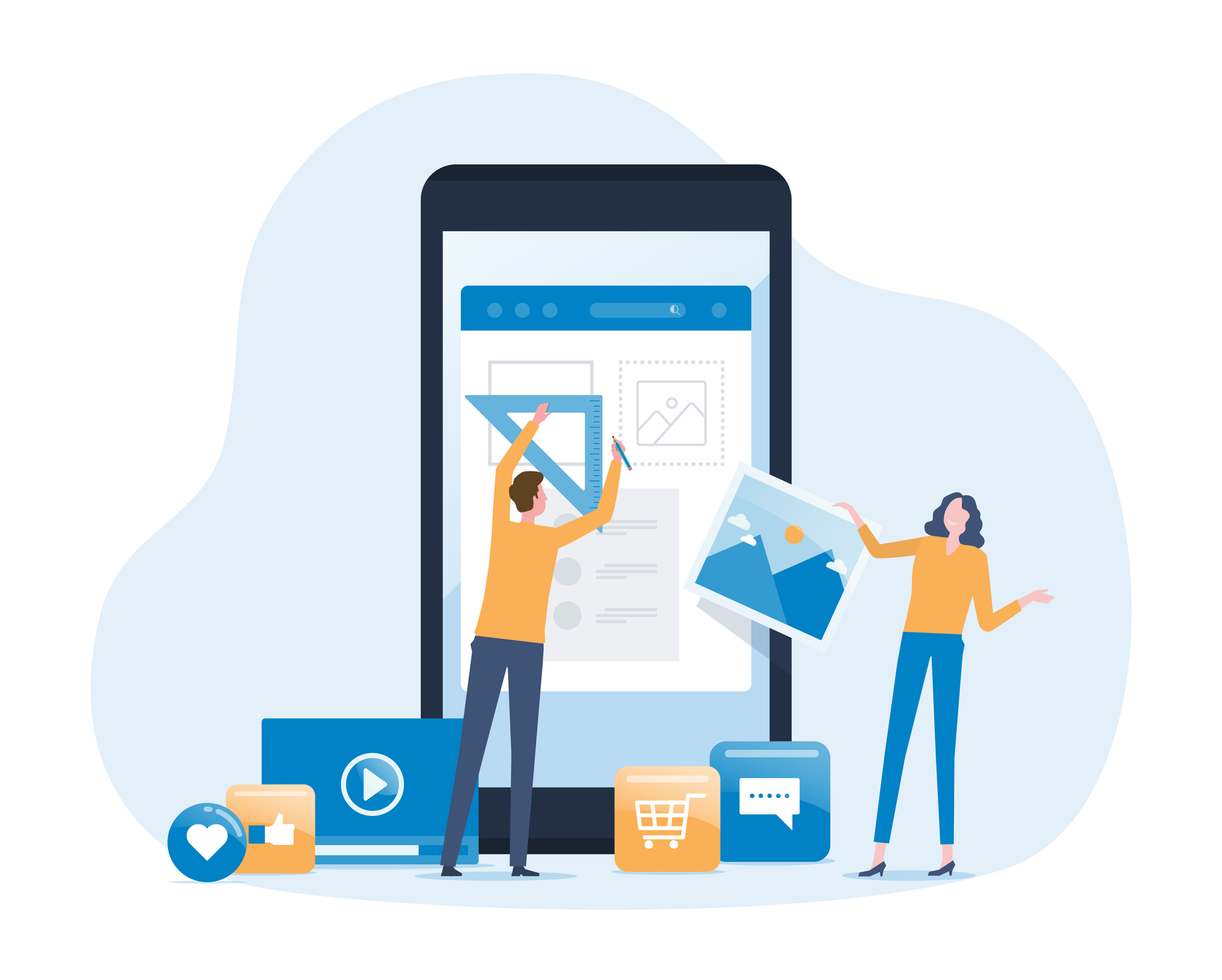
Your website is lying to you.
Not maliciously. Not intentionally. But every beautiful photo, every carefully written season description, every award-winning design choice is making the same silent promise: "We make it easy to become part of this."
But every day, someone is leaving your site without buying a ticket. Someone else is leaving without joining your list. A third person came back to learn more, found nothing that pulled them deeper, and left without feeling compelled to share. Three visitors. Three different goals. Three missed opportunities for revenue, lead generation, and engagement.
But before you can fix the issue, it helps to understand what led to it in the first place.
Odds are, your website wasn't built for newcomers. It was built for you. For your staff. For your most loyal patrons. The people who already know where everything is. The people who already love you. And when those are the only eyes reviewing the site, everything feels fine.
There are two reasons for that, and cognitive scientists have helpfully given each of them names that sound like they belong in a graduate thesis. Bear with me.
The first is the Curse of Knowledge. The instant you learned where everything lives on your site, your brain erased what it felt like not to know. Gone. Permanently. So when you click through your navigation and think "this makes sense," you're right. It makes sense to you. That's exactly the problem. Your first-time visitor may not know that "Ensemble" means "About Us." They don't know the ticket link lives under "Events," not "Performances." They just know they can't find what they came for. And they leave.
The second is Survivorship Bias. You usually hear from the patrons who bought tickets. You rarely hear from the ones who tried and gave up. They don't fill out your post-concert survey. They rarely send a frustrated email. Most just disappear quietly. Taking their wallets with them. Your feedback loop tells you everything is fine because the only people talking to you are the ones who made it through.
Neither of these makes your organization negligent. In fact, they make you human. But they do mean that looking at your own site and concluding it works is a little like asking someone if they're a good driver. Spoiler: Most say “yes.”
The rest of this article is the framework you need to get you out of your own head and into your patron's.
Resist the temptation to treat your website like a digital brochure. It's a conversion engine: Every page either moves a visitor toward action or gets in the way. There's no neutral.
One question. Applied to every page, every paragraph, and every button on your site: What is this moving my visitor toward? There are exactly three answers:
If a page can't answer that question immediately, it’s taking up space when it could be serving your mission.
Your patrons buy things on Amazon. They stream on Netflix. Every one of those experiences has trained them to expect certain things. Navigation at the top. A clear “buy” button. A checkout that doesn't demand their life story.
When your site delivers those things, visitors move fast and convert. When it doesn't, they hesitate. Hesitation is where conversion goals go to die.
Your navigation menu has four jobs:
That's it. If your navigation is doing more than those four things, it's working against you. Keep it horizontal at the top. People remember the first and last items in a list best and middle items worst. Those bookends are prime real estate and should focus on your revenue-oriented conversion goals.
It may sound hard to believe, but a button’s design can communicate even more to the visitor than the text on the label. The visual hierarchy works like this:
When everything looks equally important, nothing is. To help guide site visitors, aim for one primary call to action per page. Make it a solid button in your primary brand color. Make it big enough to tap on a phone without precision.
Give the button a label that tells a patron exactly what happens when they click it. This table shows the same action written three ways: a button label that converts, one that sounds safe but says nothing, and one that actively undermines trust.
Users rarely click through the carousel of slides, especially if the very first slide isn't enticing enough or has no connection with the task at hand. They are commonly used to fit more content into a smaller footprint, which sounds efficient in a planning meeting but misses the mark in practice. Here’s why:
Your patron didn't come to your homepage to browse. They came with a specific intent.
A rotating digital billboard of your season highlights, your sponsor acknowledgment, and your upcoming audition notice isn't serving that intent. It's competing with it.
Try replacing the carousel with a hero section: a full-width band at the top of your homepage that combines one strong image, one headline, and one button. This communicates a stronger, clearer message with fewer competing elements, which is the entire job of your homepage hero. The image should show your ensemble doing what they do best, performing, and the remaining content should be minimal and focused on moving the visitor toward one specific conversion goal.
And if your instinct is to ask where the rest of the content goes, the answer is down the page. Scrolling is not a barrier. Every contemporary study on web behavior from research firms like Baymard Institute confirms that users scroll freely when the content gives them a reason to keep going. The carousel existed to avoid the scroll before the days of mobile devices. Now, that concern is moot.
Another research-backed insight on web behavior is that users scan web pages rather than reading all of the onscreen text. Eyes sweep across the top, drop down, sweep again shorter, then track down the left side. For most visitors, by the time they reach the bottom of your event page, they're barely registering what's there.
Here’s how to use this information to your advantage:
And if your event page is long, repeat your ticket link again at the bottom. If you can, make it a floating button. Don't make a motivated buyer hunt for the button twice. Spoiler: They won't.
More than half your site visitors are on a phone right now. If your site was designed on a desktop and adapted for mobile as an afterthought, you need to take another look. Even now, designers routinely deliver website mockups in desktop-only layouts. The phone is still being treated as the adaptation, not the starting point.
Here's the design flaw nobody sees coming. On desktop, your event page looks great. Ticket buttons up top. Date, time, and venue front and center. Everything exactly where it should be. Then that same page loads on a phone, and everything falls apart. Sidebar content stacks below main content on mobile by default, That clean two-column layout with ticket buttons in the right column? On your patron's phone, those buttons just moved to the bottom of a very long page. Below the program notes. Below the chorus roster. Below everything. Your patron came to buy a ticket and instead they're scrolling through your artistic director's biography wondering where the buy button went.
To make sure everything is where it needs to be on both desktop and mobile, try moving your ticket purchase button so it’s one of the first things a patron sees. The event information your patron came for is date, time, venue, and how to buy tickets, so give them that information in that order before you give them anything else.
Test it yourself right now on your own website:
If the answer is anything other than "immediately visible without scrolling," you have work to do before your next concert.
The organizations filling seats and growing their lists aren't doing something magical. They're doing something deliberate. Every page has a job. Every button makes a promise. That's it. That's the whole framework. And now it's yours.
Start today. Pick one page. Ask with curiosity and without judgment: Does this page sell a ticket, capture a lead, or deepen a relationship?
If it doesn't have a clear answer, give it one. Revenue. A lead. Deeper engagement. One page at a time, one intentional choice at a time, your website stops being a digital brochure and starts being the hardest working member of your team. Make every click count.
Drew McManus is the CEO of UpStage Technologies and an arts management consultant with more than 20 years of experience. He is the creator of The Venture Platform, a website development solution purpose-built for arts organizations, and has been cited in the New York Times, Washington Post, and The Chronicle of Philanthropy, with broadcast appearances on NPR’s All Things Considered and Weekend Edition. He currently resides in Chicago’s Streeterville neighborhood with his wife, violinist Holly Mulcahy.
